Project: Capstone Project
Timeframe: 20 weeks, Spring-Summer 2025
Software Used: Figma, Miro
Project Type: UX Research, UI Design, Mobile Application Design

The Problem
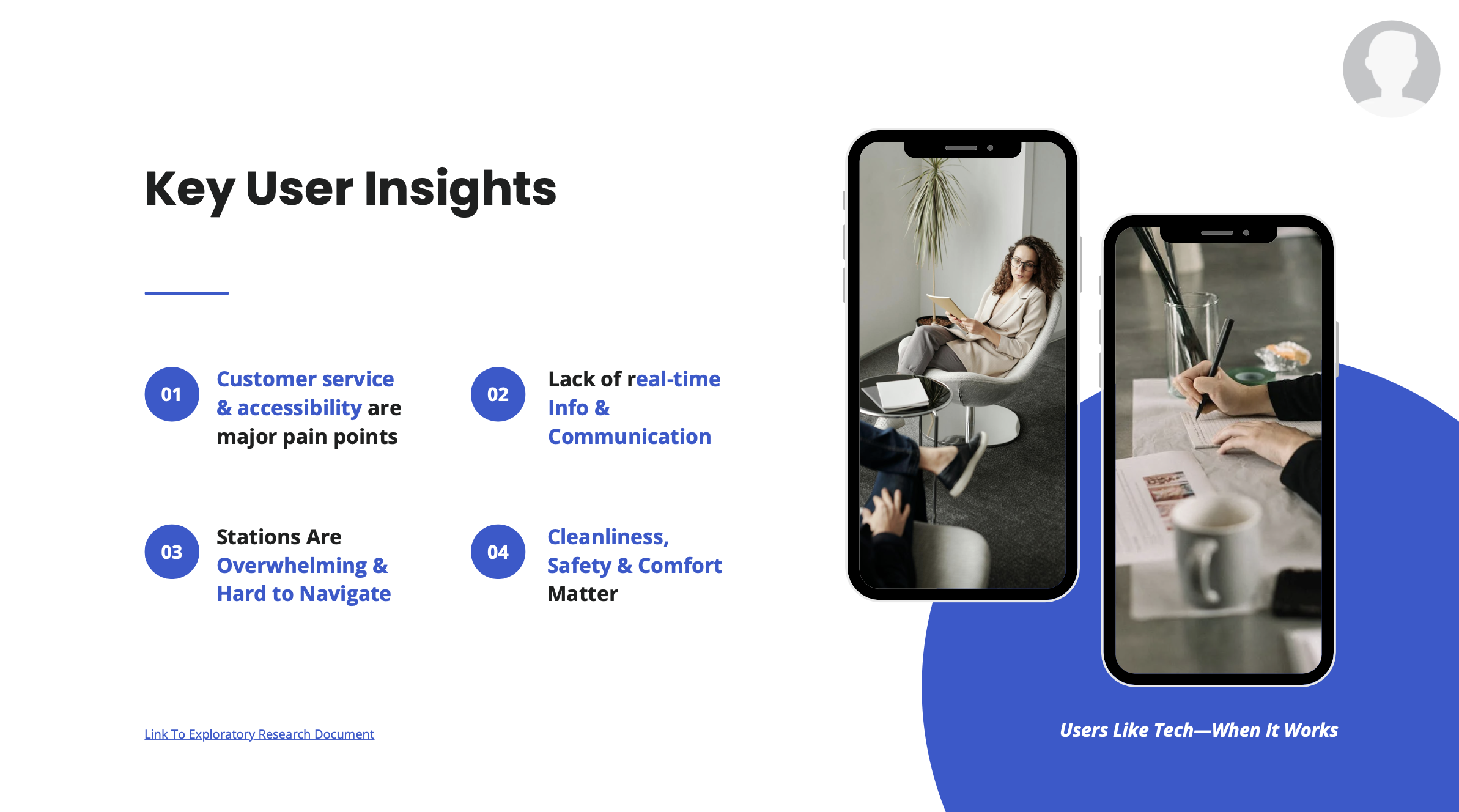
Although there are existing apps that support public transit users, many fall short in terms of usability, accessibility, and task efficiency. Our goal is to improve the experience of public transit riders by designing (or redesigning) a mobile application that better meets user needs.
Design Focus
We are focusing on mobile applications as our primary medium, due to their relevance and frequent usage in real-time transit scenarios. While the specific city and transit system will be finalized after our initial research, the goal is to create a solution applicable to real-world systems and user needs.
Our Approach
We followed a user-centered design process across two quarters:

Phase 1: Research & Strategy
Competitive Analysis: Reviewed apps like MTA, Citymapper, Transit, and others.
User Interviews: Identified pain points around onboarding, navigation, and real-time info.
Affinity Mapping: Synthesized findings to focus on key usability issues.
Phase 2: Design & Testing
Lo-Fi Sketches → Figma Prototypes
Round 1 Usability Testing: Tested early flows for trip planning and onboarding
Hi-Fi Mockups & Interactive Prototype
Round 2 Testing + Accessibility & Heuristic Evaluations
Final Iterations based on feedback
Key Features Designed
Simplified onboarding with clear next steps
Smart trip planner with filters and real-time transit modes
Clear navigation with progress indicators
Delay alerts with contextual rerouting suggestions
Personalized home screen based on user locations and preferences
Usability Testing Insights
After converting our designs to high fidelity, we conducted some usability tests with 6 users.
Overall Experience Rating: 3.81 / 5
We identified both strengths and opportunities across key areas:
What Worked
Clean, modern UI
Easy-to-navigate structure
Onboarding that built trust
Useful search and route filters
What Needed Work
First-time users were unsure what to do next
Route maps and current location weren’t clear
Delay handling felt cluttered or unhelpful
Some visual inconsistencies reduced user confidence
Improvements Made
Added onboarding prompts like “Plan your first trip”
Visual indicators for bus/train/walk segments
Real-time trip progress + location awareness
Friendly AI assistant concept ("Connor") for delay guidance
Streamlined home screen with live updates beyond favorites
Impact
By redesigning this app, we created a solution that improves:
Navigation clarity for all user types
Trust and reliability during transit delays
Accessibility and personalization across the experience
Our work demonstrated how thoughtful design can help public transportation systems better serve the people who rely on them daily.


